Inbound Marketing Blog
for Manufacturers and Healthcare Companies
5 Simple Things YOU Can Do to Improve Your Website

So you love your website, but it's just not doing what you want it to do. It's not generating leads, it's not increasing sales - really, what is it doing? The website equivalent of sitting around, smoking pot, and not paying rent like a jackass.
Your website needs to shape up. And it needs your help. There are a few things you can do from the comfort of your desk to improve your website and its contributions to your business.
Strap in and take notes, you're about to get some homework.
1. Weekly Blogging
Let's start with having a blog. Yes, you need a blog. No, you're not a special snowflake exemption just because you're B2B. No matter who you are, your customers are searching for product and vendor information online, and they're getting the information they need through industry blogs and other online resources. If you don't have a blog, they're probably getting their info from your competitors.
Here are some B2B blogging facts that will blow your mind:
B2B marketers who blog receive 67% more leads than those who don't.
Marketers who prioritize blogging are 13x more likely to enjoy positive ROI.
By 2020, customers will manage 85% of their relationships without talking to a human.
What are you waiting for? The sooner you start blogging, the faster those pages will be indexed and assisting your lead generation efforts.
Once you have a blog, you should ideally be updating it daily, though once a month is better than nothing.
Companies that do moderate blogging (1-2 times per month) have 67% more sales opportunities than companies that don't blog.
Blogs that post daily get 5x more traffic and generate 4x more leads than those that post weekly or less.
Once you accumulate 51 blog posts, blog traffic increases by 53%; 100 blog posts increase traffic by 300%; and 200 blog posts increase traffic by 450%.
Blogging is a great long-term investment for your company - the majority of traffic to your blog will actually come later, after your pages have been indexed and their authority established by Google. Just one more reason not to hold off on blogging.
2. Social Sharing Buttons
This is a super easy improvement for any website owner. Placing social sharing buttons right in front of your visitors' eyeballs makes them more likely to check out your social media pages - one study found that they increase clickthrough rates by 55%. Placing the buttons in/around blog posts, especially if they contain direct sharing links (like below), makes it incredibly painless for your visitor to distribute the posts amongst their followers.
http://www.facebook.com/sharer/sharer.php?u=https://www.protocol80.com/blog/the-effect-of-seo-on-a-small-town-business
That link leads to this:

See how super easy that is? There are also social sharing button generators that will create the buttons and link them up for you, so you don't have to worry about it if you're not technologically inclined.
However, social sharing buttons should NOT be placed on dedicated landing pages or product pages - they'll only distract the visitor from taking the intended action. Social buttons on these types of dedicated pages have been known to decrease conversions, simply because they divert the visitor's attention from the goal. One study reported a 12% increase in conversion rates once their social buttons were removed from product pages.
Social buttons work marvelously on your homepage and blog - just keep them off the landing pages.
3. CTAs
What do you want your visitor to do on your website? What actions do you want them to take? If you don't know, neither does your visitor. CTAs are like road signs pointing your visitors toward mutually beneficial destinations.
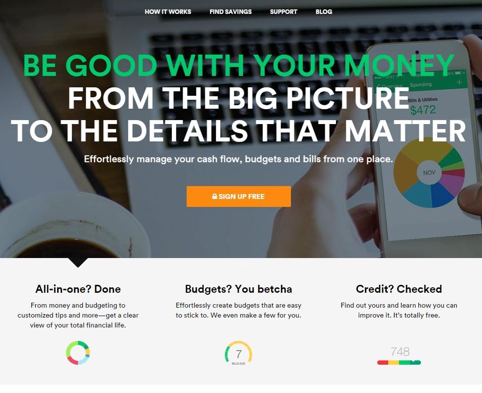
A CTA, or call-to-action, should be the first thing that draws your visitor's eye, no matter what page they're on. Take Mint.com:
 What do you think they want you to do? If you said "sign up free," you're correct! How do you know? Because that's what the shiny orange button smack in the middle of the page is telling you to do.
What do you want your visitors to do? Sign up, request a quote, subscribe, contact you? Whatever it is, make it very obvious. People are flighty and easily distracted by shiny objects. Assume your visitor is dumb as bricks and make it very easy to follow a path through your website.
4. Landing Pages
Where do your CTAs go? Road signs must lead to a destination! Landing pages are dedicated to fulfilling the promise made by your CTA. If the CTA says "Sign Up Free!" your landing page better be a form where they can sign up.
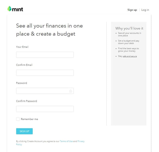
Clicking on Mint.com's CTA takes you to this page:
 Note how incredibly minimal this landing page is. There's no main navigation, no social sharing buttons (like we mentioned above), and no other CTAs. Mint wants you to sign up, dammit and that's what you're gonna do on this page.
That's what your landing pages should look like. Once they complete the form, however, you should send them to a thank-you page that shows your appreciation for their participation. You can put more relevant CTAs, social buttons, and other stuff on that page. Once they've converted on the landing page form, you've pretty much "got 'em."
5. Update Your Information & Content
This is the easiest improvement, and something many website owners overlook. You should be updating the information every few months, or whenever you make big changes. The definition of "big changes" will vary between businesses and industries - it could be anything from adding new business services to updating a daily menu. If it's important that your customers have the new information, your website should be edited to reflect those changes.
We can't tell you how many sites we've seen that obviously haven't been updated in years. It's like the owners launched the site and completely forgot about it. Don't be that website.
94% of B2B buyers research online before making a purchase decision.
Guaranteed, your prospects and customers are investigating your website thoroughly before approaching your salespeople for a chat. You want to show them the shiniest, most up-to-date version of your company; after all, first impressions can make or break a sale.
There you have it.
Five easy ways YOU can turn your website from a slacker to a hard working member of the family. Your website isn't a complete failure, we swear - it just needs a little guidance.
If you've done all these things and you're looking for more, check out this article on what makes a well-designed website. You might be able to make design improvements to further increase traffic and lead generation!
Good luck!
Our Blogs, Direct to Your Inbox!
How to Audit your Online Marketing
If you are executing digital marketing, congratulations! You are most likely already one step ahead of your competition, and making strides to meaningfully connect with prospects online. But, how do you know if you’re seeing continual success year over year, and improving your metrics?
Without the tools in place to analyze and benchmark your efforts, it is impossible to scale your online marketing and ensure continuous success.


