Inbound Marketing Blog
for Manufacturers and Healthcare Companies
What Are Lead Generation Landing Pages? | B2B Website Strategy

"What are landing pages, and why are they important to us?"
You may have heard of them, but do you know what B2B lead generation landing pages are? If you're shaking your head, you're far from alone. The lowdown is this: You need landing pages if you want to drive revenue through your website via content/inbound marketing.
This post will explain why they're a valuable B2B lead generation tool and how they turn traffic into eventual customers:
1. What Are B2B Lead Generation Landing Pages?
By the end of this post, you'll master Landing Page 101:
- What's a landing page?
- Why do I need landing pages?
- What are the key components of a landing page?
- What else should I include on a landing page?
- How many landing pages can a website have?
- What's the ideal landing page size for a website?
- How do landing pages work with PPC paid ads?
Let's start with the basics. A landing page is just another page on your website -- but with a very specific and important purpose.
Much like the main pages on your site, you can visit a landing page by entering the direct URL to the page. Here's a B2B-specific landing page example -- on this powder metallurgy manufacturer's website, you can view its AC Motor Design Guide at:
https://www.horizontechnology.biz/ac-electric-motor-design-guide-soft-magnetic-composite-material
On that page, the manufacturer links to a free e-book resource available only by submitting a form. And just like that, B2B manufacturer lead generation is born!
Landing Page vs. Website: What's the Difference?
So, a landing page is just another page in your B2B website strategy book. Then why not just call it a regular old page? Or a website?
Visual Differences
There are some key visual differences between regular pages on your website and landing pages.
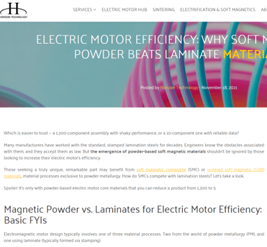
Look at this website article posted by the same company, educating readers about a similar topic.
However, these distinctions are best visible when the two page types are compared, side-by-side:
- The landing page is more focused
- The primary goal on the left is to inform the visitor; on the right, it's to drive action.
- The headline on the left is topical, whereas the headline on the right is action-oriented.
- The landing page relies less on text and more on graphics
- Overall the landing page is slightly more 'sales-y' than the page on the left.
The Difference in Accessing These Pages
With a few exceptions, the landing page on the right is only accessible by clicking a call-to-action (CTA) button -- more on these in a bit.
Splash Pages vs. Landing Pages
Perhaps you've heard of the close-ish relative of our topic -- the splash page. A website splash page can, like a landing page, promote a new offer or event (like a webinar). However, it can do other things:
- Tempt visitors with a visual tease
- Allow users to choose a region or language
- Display an alert, warning, or disclaimer (i.e. age verification)
There's no universal purpose for splash pages -- it varies based on the niche in which you're marketing. As you're about to learn, this is how they differ from the ultra-focused landing page:
2. Why Do I Need a Landing Page?
Above, the left page's primary function is to provide information. It's not visible in the screenshot, but at the bottom, there's a CTA promoting the landing page and its offer.
The landing page, meanwhile, has one purpose: To convince and allow the reader to take a specific action. In this example, that action is downloading the e-book about motor design.
So, what's in it for your company? Leads!
The landing page focuses on getting the visitor to provide contact details (and perhaps other data valuable to your B2B digital marketing strategy) in exchange for a resource. The reward doesn't have to just be an e-book or a whitepaper -- you can also offer:
- Requesting a free consultation
- Buying a product/service
- Opting into a mailing list
- Requesting a quote
- Making a donation
- Answering a survey
- Etc...
When to Use a Landing Page
Landing pages help supplement other marketing tactics, both online and off. By directing clicks to a landing page, you can increase the success rate of many marketing tactics:
- PPC (pay-per-click) advertising
- Trade shows
- Social media
By directing these tactics to a unique landing page, you can very accurately measure the effectiveness and ROI of your other marketing tactics.
3. What Are the Key Components of a Landing Page?
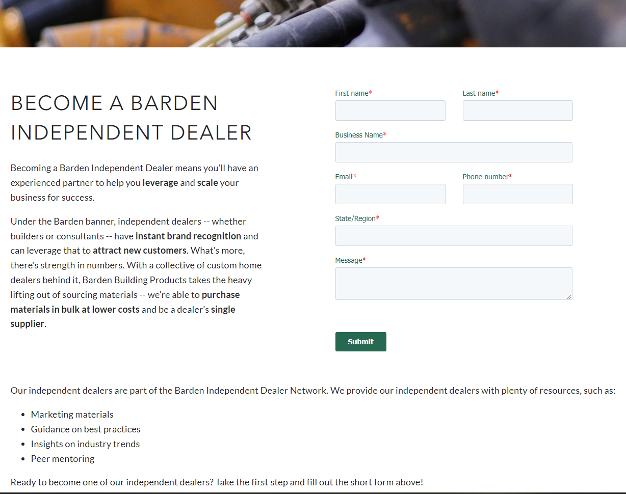
Let's use a simple example: a "Contact Us"-style landing page.
First off, pay close attention to what's not present: the website's navigation. Remember, your #1 goal with this type of page is to get that contact information (or achieve some other goal). We don't want extra menus, links, or buttons distracting the visitor.

- Banner with a striking, relevant image
- A headline that clearly explains what the user is getting
- Copy that touches on your buyer persona's pain points and outlines the offer's value
- A brief-as-possible submission form
- A highly visible submission button
- Any further information you'd like to include "below the fold" to further convey value
(p80 Resource [Blog]: How to Create a Landing Page)
4. What Else Should I Include in a Landing Page?
Every case is different, but there are many ways you can increase traffic to your page, and the conversions that result from it:
- Keywords -- Just like any other page on your site, there should be a primary keyword that Google searchers will use to find your page. It should be relevant and specific to your offer and the solutions your company brings to the table.
- Video -- Visuals sometimes convey value in a way text can't (especially if they're testimonials). Marketers using video on landing pages increase their conversion rates by 34%! Best of all, depending on what your page is offering, the video doesn't have to be Hollywood-quality.
- Next steps -- The submission button should link to a thank-you page that provides not just the user's download link (if applicable), but also additional resources relevant to their needs.
5. How Many Landing Pages Can a Website Have?
Finally, an easy one. The answer is: as many as your business needs (within reason)!
Generally speaking, you should create a landing page for every high-value offer on your website. If you have five e-books, you should have a separate promotional page for each.
Google Search algorithms generally favor websites with lots of pages and content. As for pleasing the humans you're trying to sell to ... you should be creating offers that address all stages of that looong B2B buyer's journey. So just making 1-2 landing pages for your Contact Us and RFQ forms ain't gonna cut it. Today's buyers want education they can digest on their own, months and even years before they're ready to speak to your sales team.
6. What's the Ideal Landing Page Size for a Website?
Apologies for the wishy-washy answer, but ... it depends.
In most situations, longer is better. A page that's at least 300-350 words will have a better chance of ranking organically in Google than one that's 50-75 words. Then you get the added bonus of bringing potential leads straight to your offer form, rather than hoping they reach it secondhand through a CTA.
Consider the type of "ask" you're making of the reader. Does your industry or the type of content (think a case study on B2B medical software) demand extra convincing that your offer is critical to their success? Try a longer landing page -- providing detailed, complete information can build trust and credibility.
However, certain pages -- like for your RFQ or Contact Us form -- probably won't need much copy. Just add a quick explainer of what you do and what details the respondent should include. Also, industries and offer types that rely more on impulse purchases and opt-ins might benefit from a short page that demands little of the reader's time.
7. How Do Landing Pages Work With PPC Paid Ads?
If you've heard the term "PPC landing page," you can probably guess by now what it means.
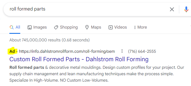
Just like a standard landing page, it's a standalone page with a narrow focus. However, a PPC page is for dedicated use with Google Ads, Bing Ads, etc. It's the place visitors "land" after clicking on an ad in search results:

Successful PPC pages focus on a single campaign goal. If you're already using PPC marketing, adding dedicated landing pages is a great way to increase conversions and lower the cost-per-click of your campaigns.
What Do B2B Lead Generation Landing Pages Mean to Your Website Strategy?
To sum it up in one sentence:
A landing page is a standalone page on your website meant to achieve a very specific objective, with little option for the user to stray from that objective."
Any business would love better lead conversion rates and opportunities. Landing pages are the best and easiest way to get there. Just remember to include:
- Keywords (and, on other pages, CTAs) that'll get good-fit traffic to your page
- A message that matches your offer and your persona's needs
- Enough persuasive (but non-sales-y) copy to match your "ask"
- A brief form and visible button
- Next steps to aid the buyer's journey
To learn more ways to use your website as a revenue tool, grab our free B2B lead generation guide:
(Editor's note: This article was originally published in January 2014 and was recently updated.)
Our Blogs, Direct to Your Inbox!
How to Audit your Online Marketing
If you are executing digital marketing, congratulations! You are most likely already one step ahead of your competition, and making strides to meaningfully connect with prospects online. But, how do you know if you’re seeing continual success year over year, and improving your metrics?
Without the tools in place to analyze and benchmark your efforts, it is impossible to scale your online marketing and ensure continuous success.


