Inbound Marketing Blog
for Manufacturers and Healthcare Companies
Thank-You Page Examples for Contact Forms -- Nurture Your B2B Leads

If you're here, you already know landing pages are a core component of capturing leads from your website. You know how to increase conversion rates on your website by offering valuable content (e-book, free consultation, etc.) in exchange for the visitor's contact into.
Now that you've captured your lead's information, what's next?
Time to send your new lead to the next step in their journey with a little B2B lead nurturing.
These thank-you webpage examples show how you can keep leads on your site longer and increase your odds of a sale one day:
What Is a Thank-You Page?
A thank-you page is a follow-up to a landing page. It’s where your newly converted lead ends up after filling out a submission form on your landing page. It delivers the whitepaper, webinar signup, or whatever else you promised on the landing page.
Already know the components of a landing page? Let’s take a look at the elements of a thank-you page that's been optimized for further lead engagement:
A B2B Marketing Thank-You Page Example
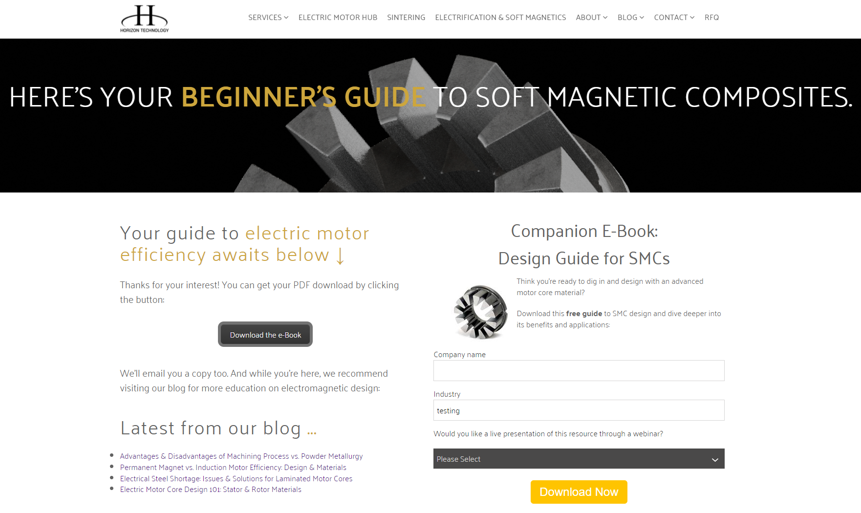
Let's use a contact form thank-you page example from Horizon Technology, a B2B manufacturer of metal components. Once you convert on their (HubSpot-made) landing page, you end up here:

Let's break down the importance of each section:
1. Give Access to Your Offer
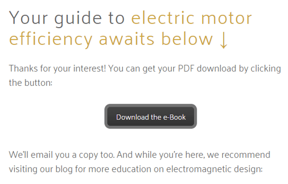
Naturally, your thank-you page will include the promised offer in the form of a download link or direct email. We like to do both.

This example company does both, too. We recommend at least one follow-up email -- even if it's just reoffering the link and asking the lead if they have questions. This tactic promotes engagement and keeps your brand top-of-mind.
As for the on-page download link, make it easy to spot and click. A button always works well.
2. Bring Back Your Navigation Links
Page design is totally different in thank-you pages vs. landing pages.
Navigation links on a landing page are distracting. Now that you have your lead’s info, bring back your navigation menu on your thank-you page. This way they can continue exploring your website.

By allowing its newly converted lead access to the rest of its website, Horizon is gently nudging leads further through their buyer’s journey.
3. Tell Them What’s Next
From element #3, we learn how to capture leads on your website ... again.
Wait. ... Why attempt a 2-for-1?
After a new lead has converted and taken advantage of your offer, you need to let them know what to do next. Bringing back the main navigation helps, but it doesn’t provide specific direction.
Add links to pages or resources related to their recent conversion, or videos that include more information.

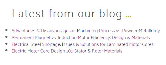
Above, Horizon is directing leads to related educational articles on its blog. (You are doing this type of B2B content marketing too, right?) Today's B2B buyers prefer to do much of their research online, so this is a great way to be their expert guide.
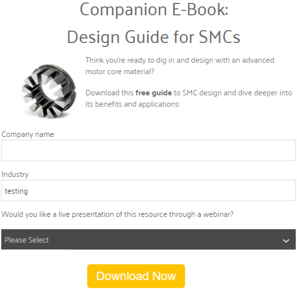
But wait! There's also a secondary conversion offer:

This secondary call-to-action improves your website conversion rate by offering related, additional content -- behind another form. Note how this teaser's language specifically implies value to those who just grabbed the first offer.
By using different form fields than those on your landing page form, you can collect additional information about your lead.
4. Include Social Media Sharing
Social media sharing buttons are also welcome back on your thank-you page. If your content is particularly shareable -- like a checklist -- consider adding social buttons to make sharing easy.

Logic says your lead associates with similar people that may have similar company pain points. If that lead shares your content with their professional network, it might be seen by equally high-quality prospects.
Beyond Thank-You Pages: 25 Examples of Website Must-Haves
On your landing pages, your newly converted leads made a choice to share their contact information with you. Don’t leave them hanging! Use thank-you pages to keep them on your site longer, gain their trust, and accelerate the B2B sales funnel.
Of course, thank-you pages are just one of many tools for optimizing conversion rates and Google SEO authority. To learn how to use every inch of your website for attracting traffic, leads, and sales, grab our free e-book:
(Editor's note: This article was originally published in January 2017 and was recently updated.)
Our Blogs, Direct to Your Inbox!
How to Audit your Online Marketing
If you are executing digital marketing, congratulations! You are most likely already one step ahead of your competition, and making strides to meaningfully connect with prospects online. But, how do you know if you’re seeing continual success year over year, and improving your metrics?
Without the tools in place to analyze and benchmark your efforts, it is impossible to scale your online marketing and ensure continuous success.


